Are you tired of your videos looking flat and uninteresting? Do you want to create a cinematic look that captivates your audience and leaves them in awe? Look no further than color grading.
Color grading is the process of manipulating the colors in your video to achieve a specific mood or style. It can take your footage from ordinary to extraordinary and make it look like it was shot by a professional filmmaker.
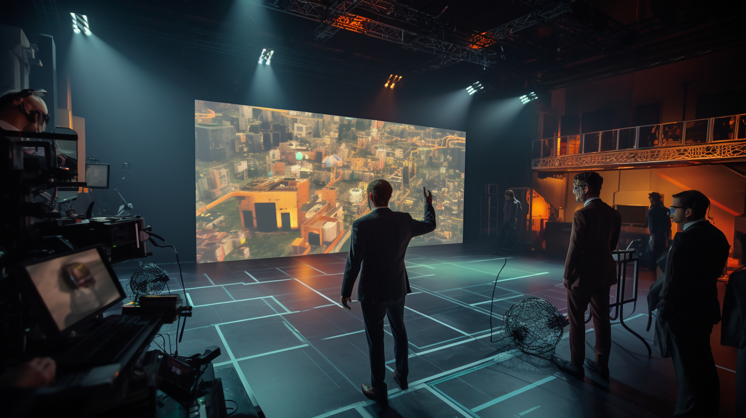
Color grading is an essential part of the post-production process in filmmaking. It can greatly impact the overall look and feel of your video, and it’s a skill that every filmmaker should master.
In this article, you’ll learn about the importance of color grading, how to understand color theory for effective grading, and how to choose the right color grading software. You’ll also learn about various techniques for achieving different moods and styles, as well as tips and tricks for creating a cinematic look in your videos.
So, whether you’re a beginner or an experienced filmmaker, read on to learn how to take your videos to the next level with color grading.
The Importance of Color Grading in Filmmaking
Color grading is an essential component of filmmaking, as it allows for the creation of a unique and immersive cinematic experience that captures the audience’s attention. Color grading techniques involve adjusting the colors, brightness, and contrast of a film to achieve a desired aesthetic or mood.
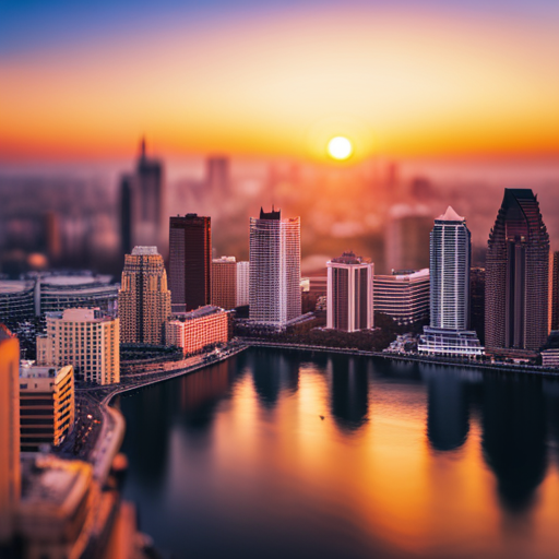
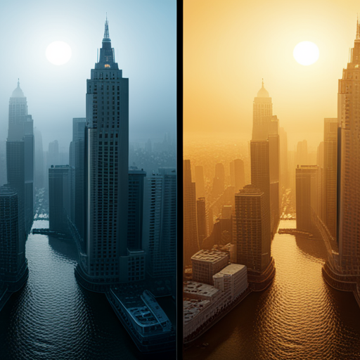
The impact of color grading on audience perception cannot be overstated. It can enhance the emotional impact of a scene, create a sense of time and place, and even convey a character’s personality. Color grading can be used to set the tone of a film, such as using cool blues and greens to create a somber, melancholic atmosphere, or warm oranges and yellows to create a sense of nostalgia or happiness.
It can also be used to create contrast between different parts of a film, such as using a desaturated color palette for flashbacks or dream sequences. These techniques can help guide the audience’s understanding of the narrative and evoke a specific emotional response.
In addition to setting the mood and guiding the audience’s emotional response, color grading can also be used to create a consistent visual style throughout a film. By applying the same color grading techniques to different scenes, a filmmaker can create a cohesive and immersive world that draws the audience into the story. This can be especially important for films with multiple locations or time periods, as it helps to establish a sense of continuity and cohesiveness.
Ultimately, color grading is an essential tool for filmmakers to create a cinematic experience that is both visually stunning and emotionally engaging.
Understanding Color Theory for Effective Grading
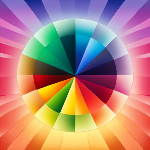
By utilizing the principles of hue and saturation, you can paint a vivid and captivating picture on the screen. As a filmmaker, it’s important to understand color theory and how it can be used to create a cinematic look. Color psychology plays a significant role in this process, as different colors evoke different emotions in the audience.
Before diving into color grading, it’s essential to choose a color palette that will complement the story and overall mood of the film. This can be achieved by using color theory to create a harmonious color scheme.
For example, complementary colors, such as blue and orange, can create a dramatic effect, while analogous colors, such as red and orange, can create a softer, more unified look.
Color grading is not just about making images look pretty; it’s about enhancing the story and creating a visual language that speaks to the audience. By understanding color theory and utilizing effective color palettes, filmmakers can create a cinematic look that not only captures the eye but also evokes the desired emotional response from the audience.
Choosing the Right Color Grading Software
When searching for the perfect software to enhance the visual tone of your film, it’s crucial to consider the user interface and level of customization offered. There are plenty of color grading software options available in the market today, and choosing the right one can be a daunting task.
It’s important to do a color grading software comparison to find the best fit for your needs. One of the best practices for color grading workflow is to look for software that offers a real-time preview option. This feature allows you to make adjustments to the color grading while seeing the results in real-time. This saves time and makes the process much more efficient.
Moreover, it’s better to choose software that supports various file formats so that you can work with different footage types without any hassle. Another crucial factor to consider while choosing color grading software is the level of support provided by the company.
Make sure that the software has a good user community and extensive documentation that can help you resolve any issues that may arise during your workflow. Additionally, it’s helpful to have access to tutorials and other educational resources that can help you improve your color grading skills.
By taking these factors into account, you can choose the best color grading software for your project and create a cinematic look that will make your film stand out.
Techniques for Achieving different Moods and Styles

To achieve different moods and styles in your film, you can experiment with various techniques that immerse the audience in the story.
One of the most basic ways to manipulate the mood of a scene is by adjusting the color temperature. By warming up the colors, for example, you can create a nostalgic or romantic atmosphere, while cooling down the colors can generate a feeling of unease or tension.
Another way to manipulate the mood of your film is by playing with contrast levels. Increasing the contrast between the shadows and highlights can create a dramatic or noir effect, while reducing it can generate a softer, more dreamlike atmosphere. It’s important to note that contrast doesn’t only refer to brightness, but also to color contrast. By placing complementary colors next to each other, you can create a vibrant and energetic mood, while using analogous colors can produce a more harmonious and peaceful effect.
Lastly, adding visual effects can further enhance the mood and style of your film. For instance, you can use lens flares to create a sense of nostalgia or a sci-fi vibe, or add film grain to give your footage a timeless, vintage feel. However, it’s crucial to use these effects sparingly and purposefully, as overusing them can distract from the story and feel gimmicky.
By experimenting with different grading techniques, you can find the perfect combination of color, contrast, and effects to bring your story to life and immerse your audience in the mood and style you desire.
Tips and Tricks for Creating a Cinematic Look in Your Videos
You can easily make your videos more visually appealing by following these tips and tricks, and according to a recent study, videos with high production value are 67% more likely to capture the audience’s attention.
To create a cinematic look, you need to pay attention to your lighting techniques and camera settings. Start by using natural light whenever possible, and if you’re shooting indoors, try to create a soft, diffused light that will give your video a warm, cinematic feel.
When it comes to camera settings, shoot in a flat profile that’ll allow you to adjust the colors in post-production. This’ll give you more control over the final look of your video. In addition, try using a shallow depth of field to mimic the look of a film camera. This’ll create a cinematic feel by blurring the background and making your subject stand out.
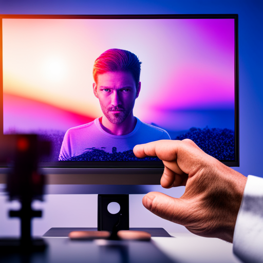
Finally, don’t forget about color grading. This is where you can really bring out the cinematic look in your video. Use warm colors like oranges and yellows to create a cozy, inviting atmosphere. Add a touch of teal or blue to the shadows to create a cool, moody feel.
Remember, the key to creating a cinematic look is to pay attention to the details. By following these tips and tricks, you can take your videos to the next level and create a truly cinematic experience for your audience.
Frequently Asked Questions
What are some common mistakes to avoid when color grading for a cinematic look?
Common mistakes to avoid when color grading for a cinematic look include oversaturating colors, overusing contrast, and ignoring skin tones. Tips and tricks to achieve a professional look include using color wheels, adjusting exposure, and experimenting with different color palettes.
How can I balance color grading with other post-production processes, such as sound design and visual effects?
When it comes to color grading and post production workflow, it’s crucial to maintain a balance between all the elements. Remember that color grading isn’t the only factor that can impact storytelling; sound design and visual effects are equally important. So, use color grading to enhance the story, not overpower it.
What are some ways to match the color grading of different shots within a single scene or sequence?
Matching the color grading of different shots within a scene or sequence is crucial for visual consistency. Use color grading software options to adjust hues, saturation, and contrast. However, it’s important to consider the importance of lighting during filming to achieve natural and cohesive color grading.
How do I account for different viewing environments, such as theaters versus online streaming, when color grading my footage?
When adjusting your color grading techniques, it’s important to consider the various viewing environments your footage will be seen in. Make viewing environment adjustments to ensure your colors are consistent and accurate across all platforms.
What are some ethical considerations to keep in mind when using color grading to manipulate the emotions of the audience?
When using color grading to manipulate emotions, ethics must be considered. It’s important to not cross the line and misrepresent the truth. Be transparent and fair in your portrayal of the subject matter.